Printer Profiles With The ColorMunki


It’s always very exciting when evaluating a new product. Being one of the first on the planet to try something out that’s going to enhance one’s future workflow or a new tool which will add benefits is great. It goes without saying that this is how it felt when Canon asked me to evaluate their new 12 ink large format printer aimed at photographers; the iPF6300.

However, it’s not all excitement and fun as there is a surprising amount of hard and laborious work involved. One of the things I was asked to evaluate was how the printer behaved with various papers; both Canon and third party. This entails having to make hundreds of prints, in colour and black and white, using a variety of images and also a variety of print settings on all these different papers.
One hurdle I soon came across was that as this printer was so new and hadn’t even had it’s European launch, I was missing a large number of paper ICC profiles. These profiles, along with the correct media setting tell the printer how to print (how much ink, how to print the correct colour, which black ink to use and a host of other ‘under the hood’ settings which are chosen automatically) once the ICC and media settings are applied in the printer driver or plug-in. These ICC profiles simply didn’t exist. Canon had supplied me with most of the profiles for their wide range of papers but Hahnemuhle and Ilford didn’t yet have profiles and were working on getting them to me for some of their papers. I also had other papers from other manufacturers like Olmec too.
At this point I asked to borrow a ColorMunki photo from Canon’s Gary Vaughan who had kindly trained me on the printer. Apart from being used for screen calibrations, the ColorMunki from X-Rite can also be used to create ICC profiles for printing.
I loaded up the software, read the concise instructions and was good to go. Although my screen was already calibrated using my Eye One Display 2 and Color Eyes software (with which I’ve always been happy) I decided to calibrate my screen with the ColorMunki too. One very neat feature is that it can measure the room’s ambient light and take this into consideration when calibrating the screen’s luminosity.
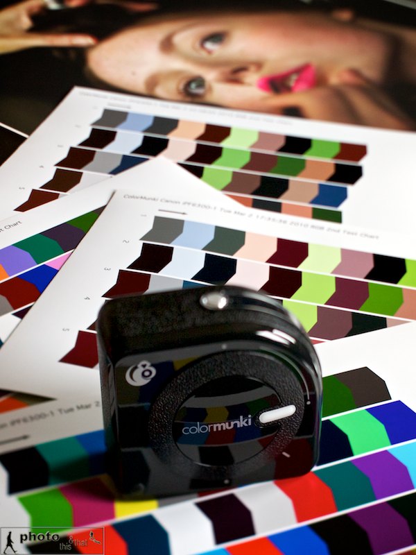
After the screen was done I proceeded to getting my paper’s profile done, and chose Canon’s Glacier paper as my first port of call. I had already made some prints with this paper using a profile of a very similar paper but the results just didn’t sing. One extremely important thing to remember when making paper profiles is to make sure that colour management is switched off in the printer driver. The software guides the user through and I must say that I’m very impressed by the way it makes it child’s play to use. After a few steps, it prints out a colour chart which one then ‘reads’ with the ColorMunki puck. All you need to do is basically run the unit over the coloured bars, one column at a time. It then creates a second print out with a different set of colours and the same step is repeated, allowing the software to create an extremely accurate ICC for that paper. So easy and very smooth.
I chose my newly created printer profile and made another print – this time the print sang. I must say, I’m so impressed with this unit. It’s so straightforward to use with extremely user friendly software and is such a capable unit calibrating my screen and printer paper that I’m in absolute awe. I cannot recommend this highly enough.

Canon’s European Launch of the iPF6300

I’ve been fortunate enough to have been asked by Canon to evaluate their new large format printer aimed at photographers; the iPF6300 which had its European launch yesterday in Lisbon. I’ve been testing it for a few weeks now with various papers and still have a long road ahead my tests on lots of papers from Ilford, Hahnemuhle, Olmec and so on. I’ll share these when I’m finished with my tests.

I’m sharing my presentation text below as it’s a great way to let you know my thoughts on this printer:

Canon Launch New Large Format Printers, Lisbon, Portugal

“Being from the school of hand printing to exhibition standard, for many years since the switch over to digital I’ve been making compromises when it came to prints made from my digital images. Having used desktop printers from Canon and Epson and also having had a variety of labs print my work, I’d never been fully happy with the quality of the prints.

I was then introduced to the Canon iPF6300.

Edmond Terakopian giving his presentation. Canon launch of iPF 6300 (and other models) large format printer, Corinthia Hotel Lisbon, Portugal. March 11, 2010. Photo: Graham Smith

As soon as I printed the very first image from the iPF6300, I knew it was something special. With it’s 12 inks I was expecting something amazing, but the quality achieved was just stunning and left me speechless – and this, was only after a test print!

The printer is of such a high standard that to the naked eye printing on the standard setting and the highest setting produce no difference to the quality of the print; what it does do is produce such a speedy output, utilising so little ink, that it has to be seen to be believed. However when ultra critical detail and subtleties have to be resolved, the higher print settings produce this at very close inspection. I was looking at the pupil and eye lashes from a studio model shoot and at the highest setting, every single eye lash is visible; every single line in the pupil, every colour change is rendered perfectly, no matter how subtle.

Pictures by Edmond Terakopian are exhibited at the event. Canon launch of iPF 6300 (and other models) large format printer, Corinthia Hotel Lisbon, Portugal. March 11, 2010. Photo: Graham Smith

Having tried a particularly testing landscape shot taken in the Lake District brought another smile. Every cloud, from the darkest to the lightest was rendered beautifully; every highlight and shadow detail, no matter how subtle was printed without any loss to this detail. It’s performance like this that elevates prints into becoming something special; something collectible. As a result, this printer is something special.

I then moved away from the Canon papers and started printing on the very popular Hahnemuhle Photo Rag which is a coated matt paper. Matt papers are very unforgiving to images with lots of dark shadow detail, so the first image I printed had exactly that – lots of dark shadows. I was astonished at how much of the subtle black detail was printed from a photo of a cafe scene. Throwing more and more images to this excellent but unforgiving paper kept producing great print after great print.

Images by Edmond Terakopian exhibited at the Canon launch of iPF 6300 (and other models) large format printer, Corinthia Hotel Lisbon, Portugal. March 11, 2010. Photo: Edmond Terakopian

I was also very pleased with the print driver and the Photoshop plugin. After around an hour I had come to grips with all that was possible using them. After getting the photograph and processing it correctly, it’s extremely critical to get the settings right in the driver and the way it has been designed makes life easy which is such a bonus. The ability to free print and send print jobs to a separate application to maximise paper usage is a fantastic feature, especially in this day and age of recession and awareness of conservation issues.

I also found the barcoding option on paper rolls extremely useful and an idea that is to be commended; with good quality paper demanding a premium, the last thing I would want is to mix up papers which would lead to wastage.

I also must comment on the printer’s quietness in use. My office is generally pretty quite and quite compact. Considering the size of prints capable, the unit’s relatively compact and amazingly quite when printing. The fact that it’s also such a speedy machine means that the printing’s done quickly and total silence returns very quickly; a must in a creative environment.

Having spent a couple of weeks with the iPF 6300, printing on various papers, both Canon and third party, I would have no hesitation in using it for my future exhibitions and collector’s prints”.

You can check out the iPF6300 HERE.

Focus On Imaging 2010

Doesn’t time fly?! It’s already that time of year where we all move up to Birmingham for a few days. It’s Focus on Imaging at the NEC.


I’ll be at the show on the SnapperStuff stand (C41) talking about ThinkTank Photo bags; by far my favourite bags. Like them so much I’m on the design board! As a special treat we have the president of ThinkTank Photo, Doug Murdoch joining us, so do pop by and say hi. Reliable sources do tell me that the brand new ThinkTank bags will be there to see too! We’ll also have the Enlight Photo’s Orbis ring flash and arm with the CEO James Madelin.

Also, every day at 1pm, I will be talking about my work and my workflow and how Aperture fits in with how I do things. With the release of Aperture 3, the role of the application has increased and become more vital. Pop by the Apple Solution Expert Demo Theatre (stand E54) every day at 1pm.

Hope to see you there 🙂

Homage – Behind The Scene Photos

Some photographs from the filming of Homage, showing the Olympus E-P2s in action. The microphone is the Rode VideoMic with a Rode “Dead cat” attached and mounted on a Manfrotto flash bracket.


Homage – A short film shot on the Olympus E-P2


A thug with a hoodie breaks into an abandoned country manor house…

A short film featuring Haylie Ecker (formerly of “Bond”).
Assistant Antje Bormann.
Shot exclusively on Olympus E-P2 cameras and Olympus lenses.
Edited using Aperture 3 and Final Cut Pro.
Microphone by Rode.

I’m delighted to say that I’ve finished another short film called Homage which was premiered today at the PEN event in the Brickhouse in London’s Brick Lane.


The Brickhouse screening of Homage

To read a little about how it was conceived and some behind the scenes stuff, please have a look at an article in the British Journal of Photography online. It goes into some detail so I didn’t want to just repeat all they have written, so please do check it out.


The Brickhouse screening of Homage

To get the full effect of how great the 720p HD is, I do suggest you go over to Vimeo and view it in HD.

Tips On Upgrading To Aperture 3

The biggest part of upgrading from Aperture 2 to Aperture 3 is that your library will need to be upgraded. The library file can hold many thousands of images (mine has around 350,000 referenced files) and all the data needed for showing edits, adjustments and metadata. All of this data, which is pretty complex, needs to go through the upgrade to use the superb new features in Aperture 3.


You can take a couple of steps to ensure a smooth upgrade. First and foremost, make sure you have a good and current backup of your work; regular readers, colleagues and friends will know my feelings on having a good backup regime. Secondly, this is not a rush job. If you have a very large library, this can take a couple of days, so try and time it for a weekend.

Whilst still in Aperture 2, start up the application holding down the ‘alt’ and ‘cmd’ keys. This allows you to then choose to rebuild your library. This will fix any issues your library has and in my opinion is a must for anyone upgrading, especially if they have an old library.

Once this is done, you can install Aperture 3. However, don’t start it just yet! I would recommend you start it by holding down the ‘alt’ key. This will let you start with a new library. Once you have done this, go into the preferences and for the time being, switch of Faces; this is the useful facial recognition facility. If you have a large library, this feature can take many hours, sometimes overnight, to go through all the many tens of thousands of faces; so switch it off for now.

Now quit Aperture and start it up again. Then run Software Update and install any updates available. After you have started up again, choose to quit. Lastly, start up again whilst holding down the ‘alt’ key and choose your library from Aperture 2. This will now begin the upgrade process. Depending on how many images you have, this could take a while. My archive goes back a couple of decades and as it’s rather large took almost four days to upgrade.

Once your upgrade has happened, the images are upgraded within the program. You can check on it’s activity by looking in Window / Show Activity. Once this is done, I suggest you quit the program, maybe even restart your Mac. Launch Aperture 3 and begin to explore. Now’s the time to switch on Faces again. As I mentioned though, this is pretty computer intensive the first time you run it, as its cataloguing a huge number of faces; I’d recommend you leave it to do it’s thing and only use the computer once it’s finished.

My last piece of advice would be to upgrade to 4Gb of RAM. Aperture 3 is not only the best imaging program in my opinion, it also becomes your multimedia hub, allowing not only storage and cataloguing of clips, but also basic editing of video and audio. More RAM will mean a smoother and more enjoyable experience.

As mentioned before, for this upgrade, it’s best to just leave the computer running overnight and over the weekend to allow it to work without distraction. The new library of Aperture 3 is faster and has a huge number of excellent features like the non-destructive brushes, so it’s well worth showing some patience. You’re going to love it!

Addendum: Thanks to Carlo with his comment below which reminds me:

1- Aperture will need twice the space of your current Library for it’s upgrade; the reason for this is simply that in case your upgrade fails, you still have your original Library file intact. It’s a great safety feature.
2- As drives get fragmented over time, to have the absolute smoothest upgrade, get a new drive (internal SATA or external FW800 ideally) and format this. Then drag over you Library file. This allows it to to copy across and keeps all the data continuously and not in a fragmented way.